
Archive for the 'Photo Related' Category
Chase Jarvis
So, a couple of weeks ago, there was this big photo shoot in an old hangar that Chase Jarvis and some of the flickrites put together, with a bunch of rented pro lighting setups donated by Glazers, and a bunch of models and breakdancers and bmx riders and stuff. And I haven’t put anything up here yet, but then again, I still haven’t gotten my light stands out of the trunk either.
Chase just released pics from another hangar 30 gig that he did — this one with less people and more music. Songs for eating and drinking where he got a bunch of really talented musicians and a talented cook together in the hangar, and shot pictures and video of the result.
No comments40D, First Impressions
I’ve had the 40d for about two weeks of shooting, and in that time I’ve done some plain old outdoor bright sun shooting, some studio/flash with the kids, a photowalk, and some other random stuff.
The Good:
* Focus is fast and positive. I’m getting shots of the kids that would not have happened on the Rebel because the focus would be hunting. It’s still not great about choosing the right focus point, but thankfully, I’m used to doing that myself, and the method is just about the same.
* It’s fast. And pretty intelligent. It takes a lot of pictures, quickly, and allows review quickly. No more 30 second wait. And I’ve never come close to filling the buffer, except when I just held down the shutter to see how long it took to fill the buffer.
* Noise performance and image quality in general seem really good. It’s a couple of generations better than the old camera, so it’s pretty much as expected.
* Auto Iso seems to be reasonably good. It would be nice if it would go to 1600.
The Bad:
* I can’t get confirmation of good focus on the LCD. Everything looks soft on it, even stuff that is razor sharp when the RAW is opened in Lightroom.
* Who ever designed the on/off/- switch should be fired. In the on position, the big dial and anything that it controls is disabled (e.g., aperture in M mode. Exposure bias in Av/Tv. White balance and drive if you press their buttons). In the – position, the dial can be used. I know that this dates to the 30D at least, since I borrowed one of those and it baffled me then. I understand the possibility of wanting some settings to be protected, but to have the protection be part of a switch that’s touched every single time the camera is turned on — that’s just dumb. It gets in the way in a “Why isn’t this working, what’s set wrong” way. I’d prefer that it was a custom function, or a menu item, or overload the print button for that. Or, even better, just turn it off in any of the modes where the camera assumes that the operator has a clue. (M/av/tv)
* I don’t understand the metering. The Rebel was dumb, but consistent, so I could meter and adjust as necessary. This one has 4 modes, and I haven’t figured out how they differ from what I want. It seems to push towards over exposure more in very contrasty situations, but then again, there’s more headroom on the sensor. It’s a learning curve thing.
* It’s fast. Very easy to outrun the flash recycle time. Also, files are bigger. Fills the cards and drives faster.
Wishlist:
* I’d like to choose some focus points, not all, not just one, and have the camera choose from those. e.g., I’m shooting a portrait. I’d like to enable the three top off center ones, since that’s where the face is going to be.
* Mirror Lockup.
* I understand that there’s a great history in custom functions, but really. There’s a menu system. It would be nice for them to be a little more explained and integrated, and most importantly, grouped so that mutually exclusive ones can’t be activated at the same time. (e.g. Extended iso range and highlight priority)
* Bigger cards, laptop hard drive, and storage drives :>
No commentsDetails on what happened to the Rebel, and how to fix it.
In essence, this is what happened, though the spring looks like it’s in the right place, just the pin is gone.
It’s a cheap repair, at least once you’ve done 30 steps of disassembly of something that’s probably not meant to be disassembled. It’s $200+ from Canon. And another view from someone else who had the same problem.
And, I have this sneaky suspicion that once the thing is all apart, this IR filter removal mod would not actually be that hard to do. I mean, the hard part is getting the camera apart and back together again. And an IR camera would be cool.
No commentsShorpy
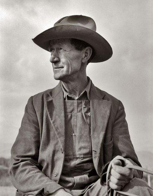
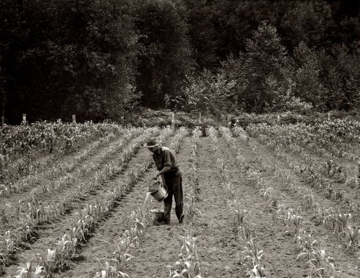
I have a thing for some of the older photo images, especially some of the ones that were shot for the FSA and other government agencies during the depression era. Lewis Hine, Dorthea Lange, that sort.
Shorpy.com is digging these up and runnning them as a weblog, and at the same time, offering prints. I’ve spent a bit of time in the last few weeks poking around — of course there’s Hine’s Powerhouse Mechanic, but there are a few from Dorthea Lange that I find quite powerful.
and
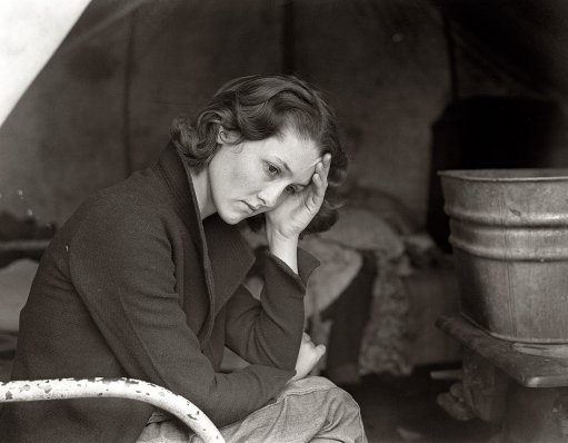
Migrant Daughter
Disasters in stock photography, part 352
This came in the mail a couple of days ago — a non-descript Dell catalog with more of the latest and greatest in cheap consumer computers. (And displays, but, I order online when the prices are favorable).

This looks like a nice little ad for Windows Security software. Attentive users, clean design. But wait, what’s that laptop? What we have here is a first generation tibook, complete with the paint rubbing off where the user’s wrists rest on the white surround. Oh, and the logo is photoshopped out of it.
I don’t know if this is Dell’s doing, or if it’s something from Trend Micro, but the message here is: It’s not safe to use our products on the net, and if you do, you need something else. And that something else is an old Mac.
I’m guessing here that someone took this as stock photography, and to avoid trademark issues, they surgically removed the big Apple logo on the screen lid. Someone picked it up and used it in the ad, not realizing that it’s a competitor’s laptop. If Dell commissioned it, I just don’t see them saying to just use a mac.
No commentsFilm
I went to a Flickr Meetup a couple of weeks ago, 50 photographers, a couple of pros, a bunch of models, and one big aircrafe hangar for a studio. I took the new old film camera, shot a couple of rolls, and was happy with the outcome. It’s a different feeling shooting on film, both for me and the models. And the results are different too. Maybe less contrast, a different depth of field, and different grain.

This is Awan, one of the models there with a lighting setup that I jumped on from one of the other photographers.
No commentsThe Fair
Last weekend was big and busy between the Island County Fair and my Strobist Photo Seminar. Basically on the run all weekend, now I’m looking forward to a work week where I can relax a bit.
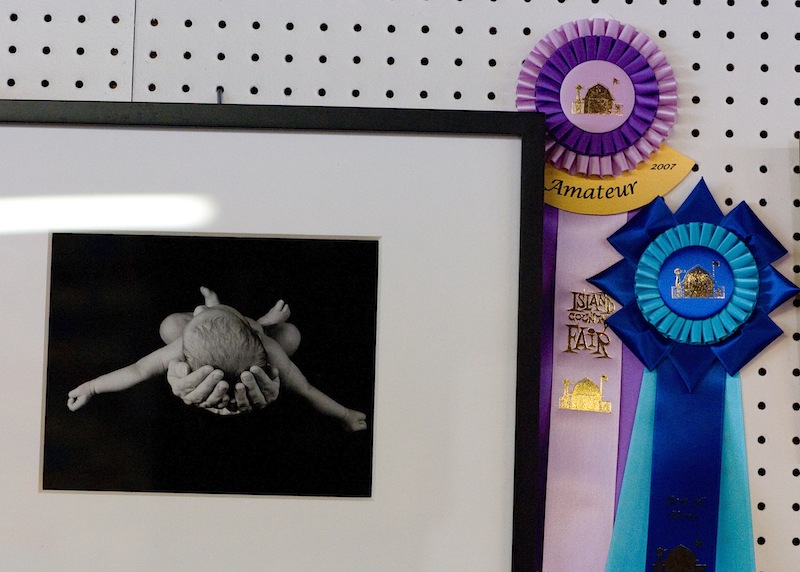
Flying #2 won Best in Show, Best Amateur, and the People’s Choice Awards. That’s pretty much a sweep. Ben and the Cedar Tree got a blue ribbon.

My Honey Wheat bread got best of the yeast breads, and the white got a red ribbon. (But I was almost not going to enter the white, since it didn’t make the nice loaf shape that I was looking for.)

All in all, not bad for entering 4 items. I’m not sure what I can do to top the photo entry next year. Maybe go for the pros in their own category.
No commentsThe next camera
Since We’ve got a camera that’s more than a few minutes/days/months old, I’m thinking about what I don’t like about it and what I’d want in the next one, assuming that I’m not just going to rush out and buy the really expensive one, features be dammed. We’ve got the original Digital Rebel, 300d, a 6MP camera that’s perfectly adequate for almost anything. It doesn’t generally get in the way, and it produces really nice images when run properly. It’s 2 generations old by now, so there’s possibly some significant advances to be had. What I’d like in a new one, or rather, what annoys me and I want to change from this one are:
- Â Buffer Depth/ Time to clear a full buffer. With a 4 image buffer and quite a few seconds to clear once it gets full, I find myself waiting on it a lot. It’s quite a bit slower than the recycle time of the flashes when they’re below full power. Â It doesn’t help that I shoot raw, but then again, that’s where the image quality is.Â
- Tungsten white balance. It’s awful, either on the auto or the tungsten setting. It’s fine if I shoot a custom frame, so I know that the camera can do it. It’s rare that I do that when I’m shooting around or under varying light conditions. I can fix it in LightRoom, but I’d still rather get it right in the camera. Â
- Autofocus speed. It can be really slow, or hunt badly. I know that AF has gotten better. Â
- Lower, less objectionable noise at high ISO, and an ISO 3200/ISO50 range expansion. The noise at the high end is starting to wear on me, especially since there are sensors that do so much better out there now. The pictures I’ve seen online show that the top of the line 1DM3’s 6400 performance is probably better than the Rebel’s ISO 800.Â
- Onboard flash that can be configured for non-TTL and manually turned down. Sometimes it would be nice to run optical slaves from the onboard flash.Â
What I don’t necessarily need is more megapixels, a smaller camera, better battery life, or a different lens mount. (though the Pentax pancake lenses look nice)I was hoping for the Canon 5d to come down in price, or have essentially it with a 1.6 crop sensor in place of the 30d. The 30d hasn’t advanced the art as much as many reviewers would like, being more of a warmed over 20d than a scaled down 5d.I got a chance to shoot with a 30d at a wedding, when the Mother of the Bride’s camera found it’s way into my hands, after being handed to someone who looked very uncomfortable with it. (Sample question: Where’s the zoom? )  Despite not being able to find some of the controls — aperture in full manual mode, exposure compensation in Av — and starting out shooting people in white in full sun in jpg on iso 1600 — I was able to get it to a reasonable point.By that point, it felt relatively natural. Autofocus was blazingly fast, buffer depth was enough, and sun on white clothes was tamed.  It felt far better than I would have expected, given the reviews of the camera. It’s probably not everything that I want, but it’s certainly enough for what I’d want. But I’m not really in the market yet. Just thinking about.Â
No commentsPantone Huey vs the Macbook, Part 2
In which I get a reference calibration.
First, a problem image, screen captured from my camera. Note that this image has blue and yellow/green fringes in the mid gray regions. This is an all gray image, so there should be no color there. (The absolute colors are off here due to the capture).
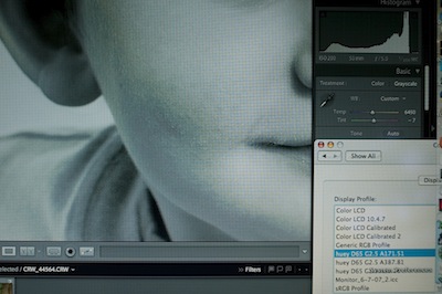
That same image, using the monitor calibration from the EyeOne, shows a smooth grayscale and no color banding.
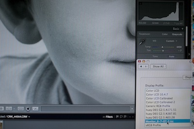
The OS profile for this monitor shows a little color banding, but nowhere near as much as the Huey profile, and not enough to show on one of these screenshots.
After seeing the EyeOne calibration, it’s not the monitor, it’s the calibration. Comparing the calibrations, it’s pretty clear that they significantly differ, at least in the curves.
1 commentBecause Sometimes Microstock is too Expensive
I was just browsing along, when this low budget ad caught my attention. It’s selling patches, or watermarks, or something.

An image at this resolution from istockphoto is $1, shutterstock takes a $199 subscription for the ability to download 25/day for a month. (And it’s on the first page of search results from shutterstock).
Perhaps the diet patch business isn’t as good as my email box would have you believe.
No comments